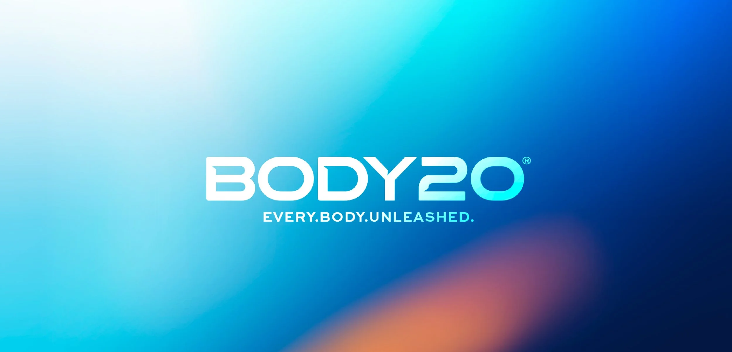
BODY20 / Boutique fitness redefined
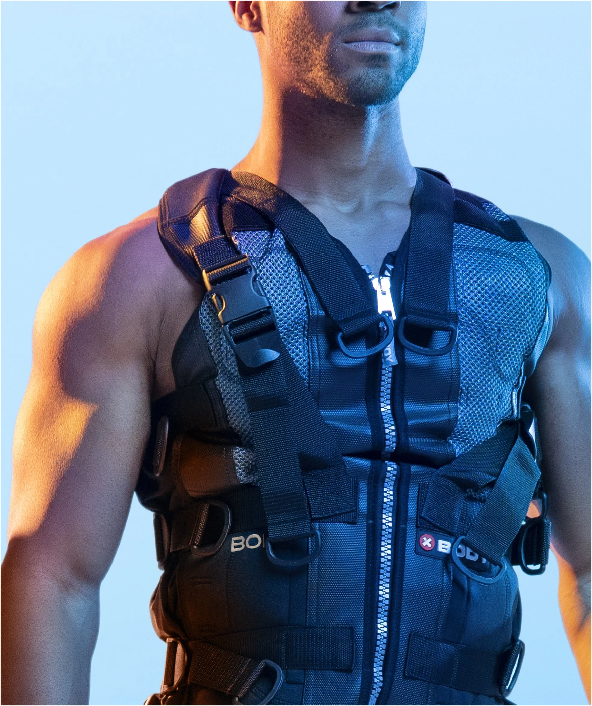
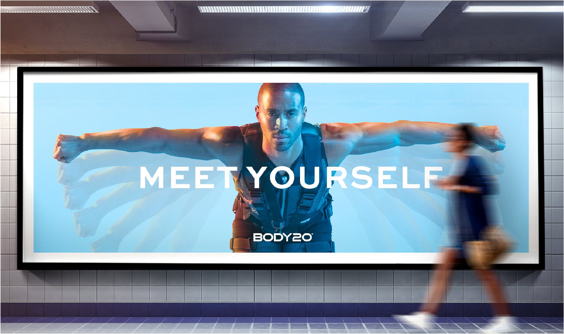
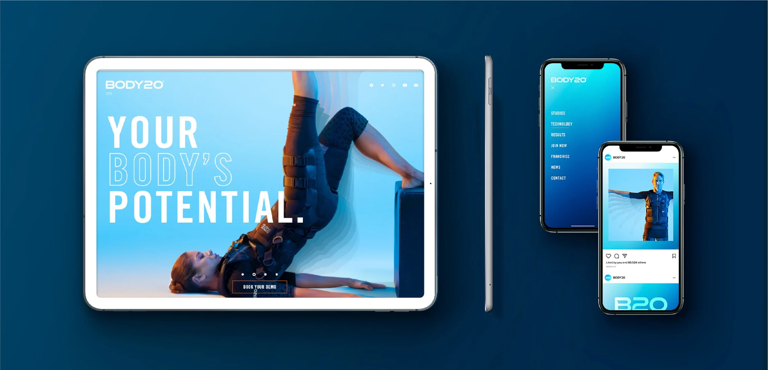
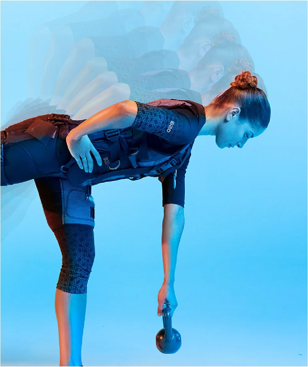
The Body20 workout, using electro-muscle stimulation, required a brand design that vividly communicates its boldness and benefits. Our design for this boutique fitness studio captures the essence of Body20's unique offering.
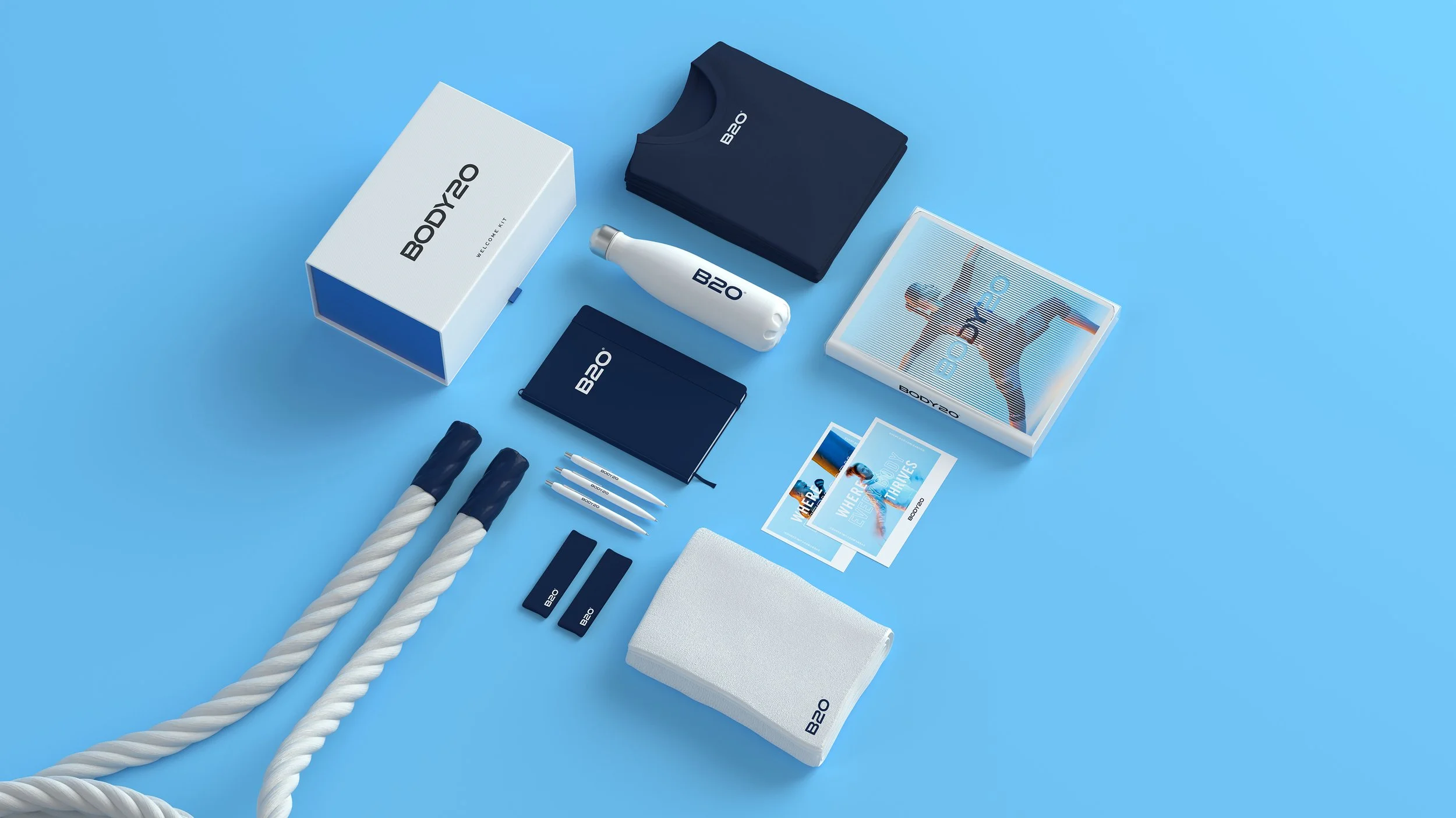
The logo was crafted to convey strength and purpose while allowing for personal interpretation. It features custom cuts that signify technical performance and efficacy. The color palette transitions from warm oranges to cool blues, symbolizing the body's response during and after the workout. Vibrating typography highlights the EMS technology, and the color scheme enhances the brand's presence within the Body20 studios.
As clients enter, they are greeted with calm blues, setting a serene tone. This shifts to more vibrant colors in the changing rooms, building anticipation, and culminates in an energetic, dynamic workout space. This thoughtful design takes clients on a visual journey, reflecting the transformative experience of Body20


Agency: Pearlfisher
Hamish Campbell - Executive Creative Director