JoyJolt / A jolt of joy in the glassware aisle
Scope: Brand Creation
Role: Design Director & Proud Coach
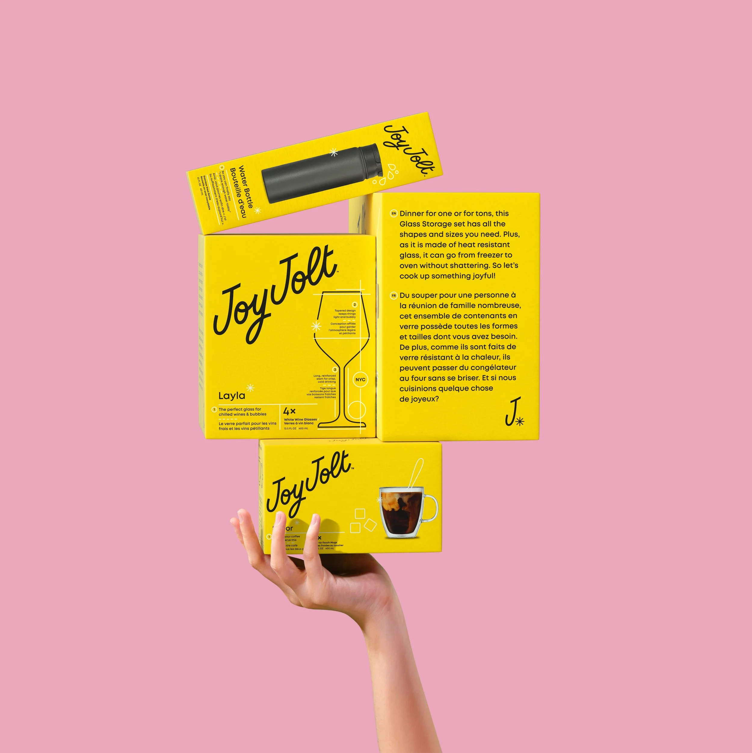
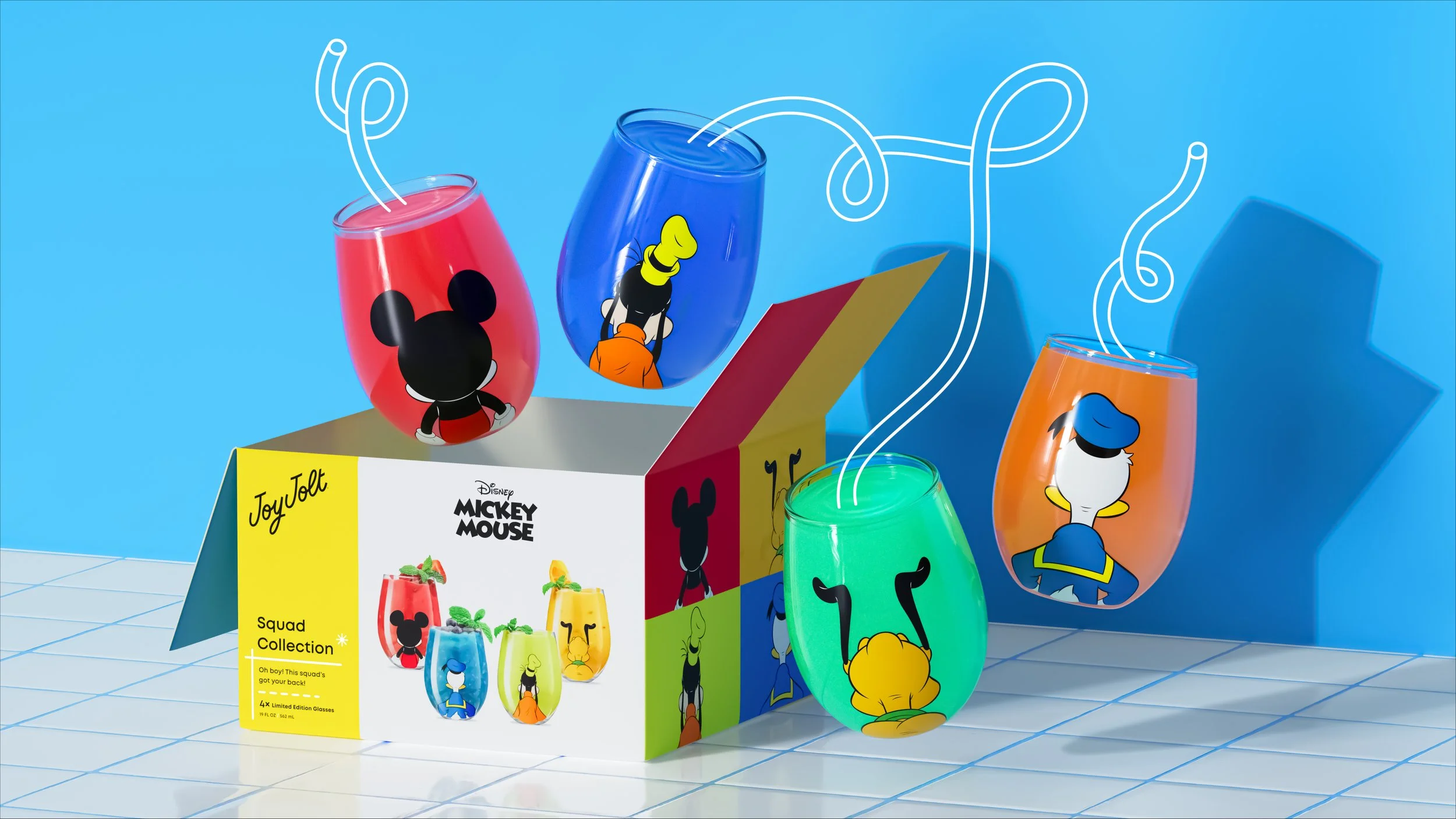
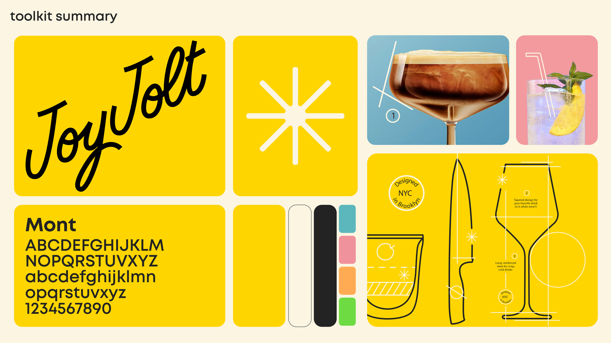
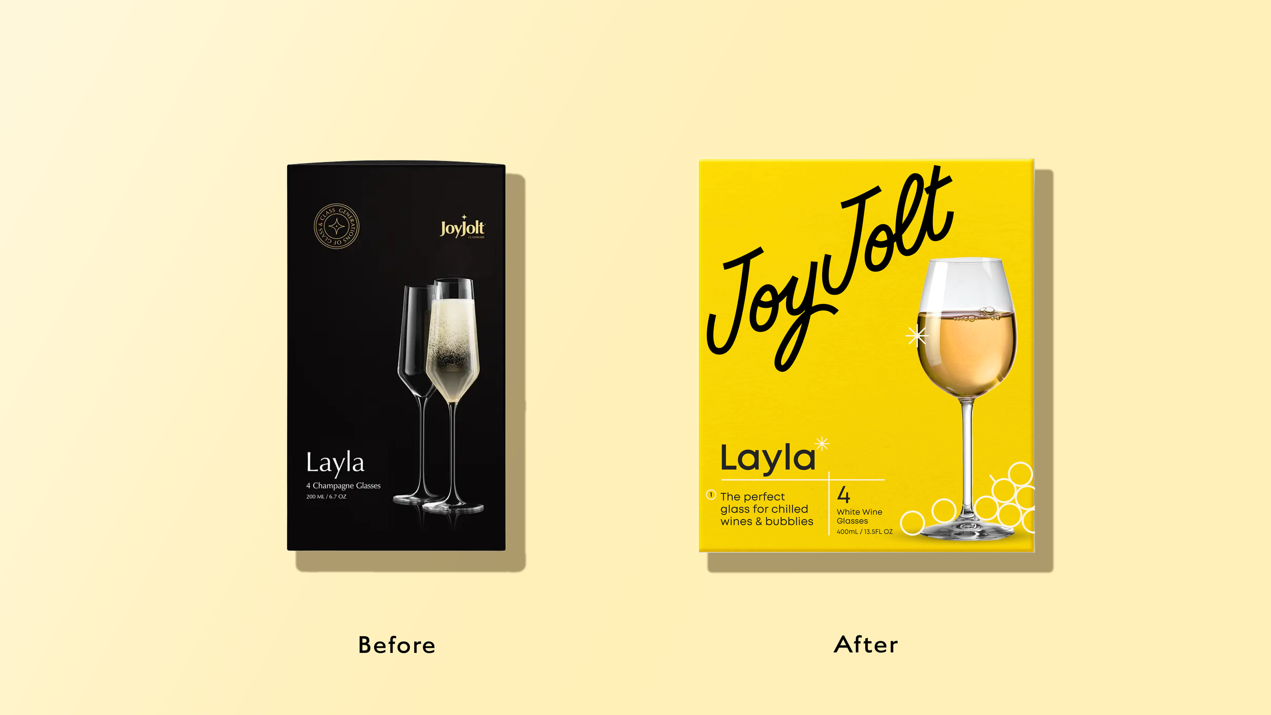
In this redesign, we introduced Joy, a character who embodies our passion for detail with a playful twist, ensuring every interaction with the brand is delightful. To stand out on the shelf, we drew inspiration from JoyJolt's New York roots, using a warm yellow and crafting a logo that feels both approachable and refined. This new concept beautifully captures the brand's fresh direction.
JoyJolt's entrepreneurial spirit, meticulous attention to detail, and commitment to quality shine through in every aspect. The iconic taxicab yellow and black pay tribute to their New York City heritage, while the asterisk detail in the logo evokes a sense of classic blueprints, emphasizing the brand's unique identity.
Here's to JoyJolt transforming the glassware and kitchenware category—with our double-walled JoyJolt glasses, of course!


Agency: Pearlfisher
Matt Sia - Creative Director
Olivia Larsen - Designer
Talia Evans - Associate Strategy. DIrector